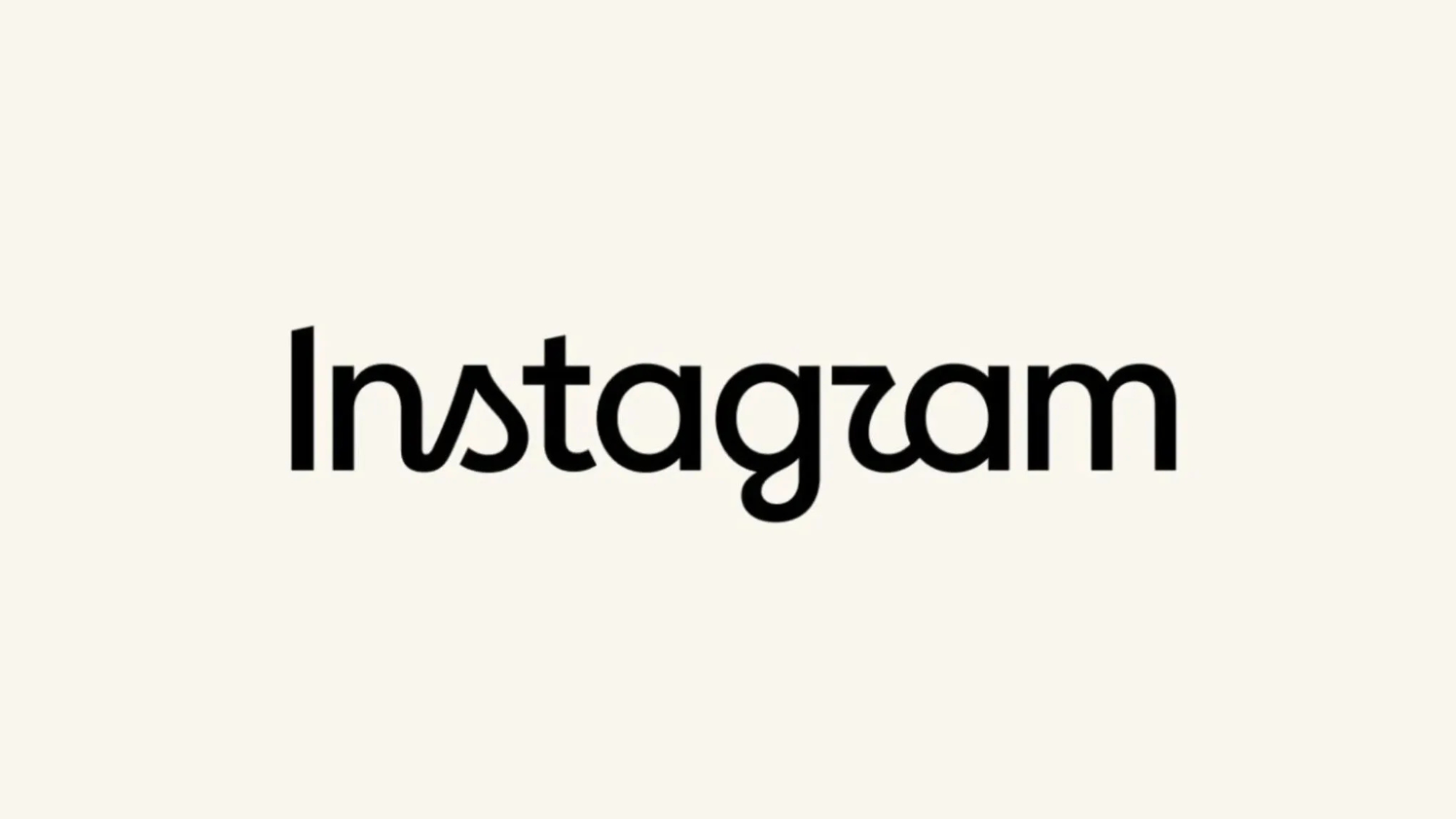
Instagram has refreshed a key part of its visual identity, unveiling a redesigned wordmark for the first time in nearly 10 years. The update changes the way “Instagram” appears at the top of the app, while the platform’s familiar pink-and-orange gradient camera icon remains unchanged.
Instagram head Adam Mosseri announced the change on Instagram and Threads, explaining that the wordmark had remained unchanged for a decade and was therefore due for a refresh. He described the new design as “cleaner and more modern,” while retaining references to Instagram’s original simplicity and craft.
A Small Design Change That Created a Big Internet Reaction
The redesign sits somewhere between Instagram’s familiar cursive identity and a more contemporary typographic treatment. The new lettering retains flowing, curved forms, particularly in letters such as “s”, “r” and “g”, but gives the overall wordmark a sharper and more modern appearance.
However, the internet was quick to notice something Instagram may not have intended: some users say the new wordmark looks more like “Instagzam” than “Instagram.” The shape of the “r” has become a particular talking point, with reactions ranging from amusement and criticism to curiosity about the design choice.
For a brand as instantly recognisable as Instagram, even a relatively small typographic change can attract enormous attention. The previous wordmark had been part of Instagram's identity for a full decade, giving users plenty of time to build familiarity with its distinctive handwritten appearance.
That makes the redesign an interesting branding exercise. Instagram has not attempted to completely reinvent itself. Instead, it has chosen to evolve a familiar asset while keeping its strongest visual cue, the gradient camera icon, intact.
From a brand perspective, this is a relatively low-risk way of signalling change. The company can modernise its typography across the app and other brand touchpoints without forcing users to relearn the visual symbol they already associate with Instagram.
But the immediate reaction also highlights an important lesson in identity design: modern does not automatically mean clearer. A wordmark may look more distinctive or contemporary to designers, but if audiences struggle to read the name instantly, the redesign can create an entirely different conversation.
Interestingly, the controversy itself has given the new wordmark something every major rebrand hopes for: attention. Within hours of its launch, the “Instagzam” nickname became part of the conversation around the redesign. Whether that reaction fades as users become familiar with the new lettering or continues to define the redesign remains to be seen.
For now, Instagram has made a subtle change after a decade of visual consistency—and managed to turn a few redesigned letters into a global branding conversation.
The icon stayed the same. The word changed. And the internet noticed.